
How to Coordinate Outfits for Family Photos (Without Looking Too Matchy)
One of the biggest misconceptions about family photos is that everyone should wear the exact same outfit.
Remember the days of white shirts and blue jeans?
Thankfully, family photography has evolved. Today, the most timeless portraits come from coordinating outfits—not matching them.
The goal is for your family to look connected, not identical.
Start With a Color Palette
Instead of picking outfits one person at a time, begin by choosing 5–7 complementary colors.
Think of your wardrobe as a paint palette. Every outfit should contribute to the overall look without competing for attention.
For example, a beautiful early fall palette might include:
Cream
Camel
Olive
Dusty Blue
Rust
Chocolate Brown
Not everyone needs to wear every color. Spread them throughout the family so your outfits feel balanced and natural.
Dress Mom First
I always tell my families to choose Mom's outfit first.
When Mom feels confident, everyone else becomes much easier to coordinate around her.
Choose a dress, sweater, or outfit you genuinely love, then pull colors from it for the rest of the family.
Mix Shades, Not Copies
Instead of putting everyone in the same navy sweater, vary the tones.
Try:
Dad in navy
Mom in cream
One child in olive
Another in rust
Baby in oatmeal
The result feels layered, rich, and visually interesting.
Texture Is Your Secret Weapon
Texture photographs beautifully.
Mix materials like:
Linen
Knit sweaters
Corduroy
Denim
Velvet (late fall and winter)
Cotton gauze
Wool
Even when everyone wears neutral colors, texture keeps your photos from looking flat.
Patterns Should Be the Accent
Patterns are wonderful—but only in moderation.
A floral dress, subtle plaid shirt, or tiny gingham can add personality.
The key is to let one or two people wear patterns while everyone else stays mostly in solids or soft textures.
Avoid multiple bold prints competing for attention.
Think About Your Location
Your clothing should complement the scenery—not blend into it or compete with it.
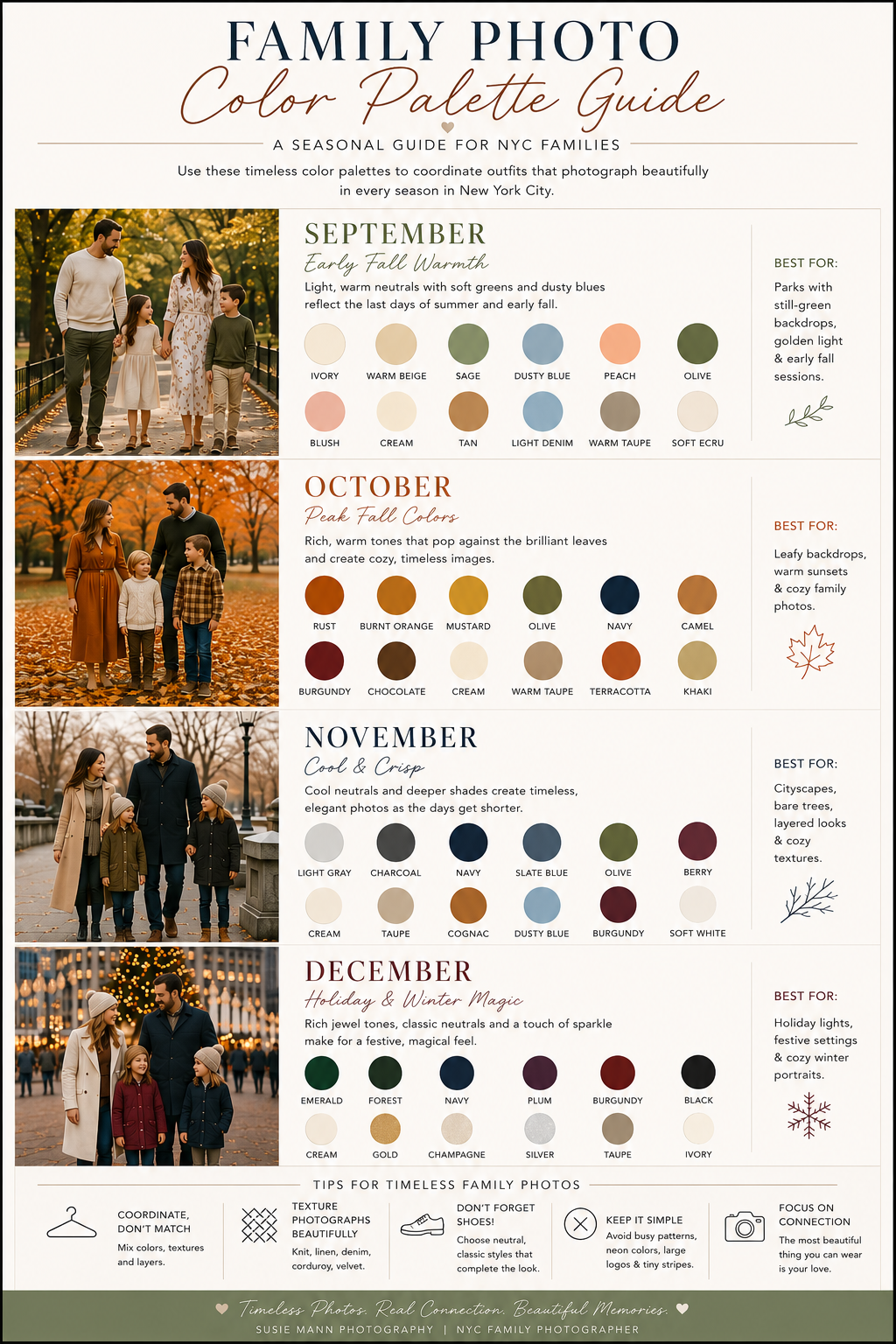
September
Soft greens, creams, dusty blues and warm neutrals pair beautifully with parks that still have lush greenery.
October
This is the month for rich earth tones—rust, mustard, olive, camel and burgundy—that pop against changing leaves.
November
As the landscape becomes more muted, deeper neutrals like charcoal, navy, cognac and cream create elegant, timeless portraits.
December
Lean into classic winter style with jewel tones like emerald, sapphire, plum and burgundy mixed with cream, camel, charcoal or black. Holiday lights and city decorations make these colors especially striking.
Shoes Matter More Than You Think
The easiest way to elevate your photos?
Choose shoes intentionally.
Great options include:
Leather boots
Chelsea boots
Loafers
Ballet flats
Neutral sneakers
Riding boots
Avoid bright athletic sneakers, flip-flops, and shoes with large logos unless they genuinely fit your family's style.
Don't Stress About Perfection
Children wrinkle clothes.
Toddlers spill snacks.
Dogs shed.
That's life.
The most meaningful family photographs aren't perfect—they're authentic. Coordinated clothing simply helps keep the focus where it belongs: on your family's connection.
Download My Free Fall Family Photo Color Guide
Not sure where to start?
I've created a free printable Fall Family Photo Color Guide featuring month-by-month color palettes for September, October, November, and December, plus outfit inspiration and styling tips to make planning easy.
Download it, save it to Pinterest, and use it the next time you're planning family photos in New York City.